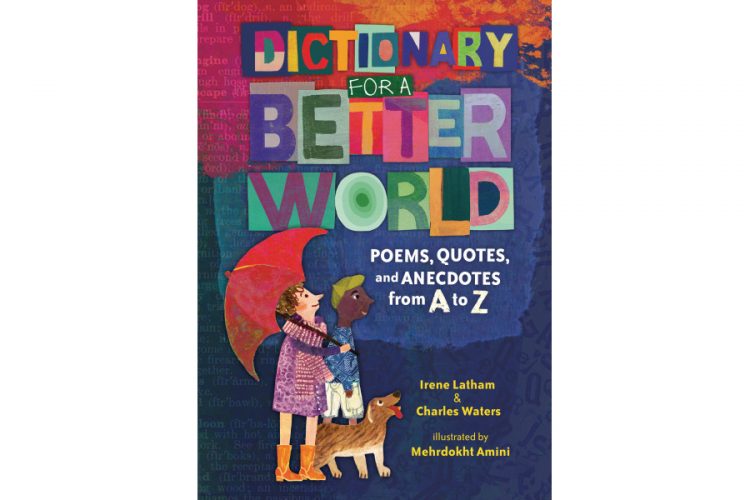
The Art of Dictionary for a Better World
by Danielle Carnito, Trade Art Director
Every book has its own mix of creators bringing their voices to the process, making the project the best it can be. With Dictionary for a Better World , we had an amazing team.
Authors Irene Latham and Charles Waters, Illustrator Mehrdokht Amini, Editors Carol Hinz & Jordyn Taylor, Designer Kimberly Morales, Production Designer Erica Johnson (and I had some thoughts in there too as Art Director), throughout the bookmaking process were full of ideas, full of humility, respect, and of course all full of art and words. This post could cover so many things… but instead of covering all of the things, let’s focus a bit on the art. An Art Director is writing this, after all.
When I was first talking to Mehrdokht about working on the illustrations (crossing my fingers she would agree to the project), I was dreaming of what she could come up with to illustrate the words—this is not a typical picture book. So much of what we were asking of the visuals was symbolism and ideas rather than things. With the book now done and the illustrations all so effectively varied, designer Kim and I had some burning questions for illustrator Mehrdokht Amini about her art and process, so we roped her in to this post by reaching out for answers. Enjoy these behind the scenes moments of how a book gets made!
Was there something that initially drew you to collaborate on this project?
MA: Acutely, there was! Prior to this project I had worked mostly as a children’s book illustrator but my major is in Graphic Design. This project was exceptionally attractive for me because it enabled me to combine my graphic design background with the experiences I had as an illustrator. Another interesting aspect of this commission was the age group and also the fact that I was more used to classical narrations and the support of the storyline to give me the ideas for visualising the text, whereas this job gave me the opportunity to leave my comfort zone and act a little bit more independently from the text.
The details, variation of art mediums, and compositions were very impressive—even from the beginning sketch phase of this project! How did you decide what might work best for each poem considering how many there were?
MA: From the very beginning and after the discussion with the art director, we decided to follow a versatile approach. There are more than fifty double page spreads in the book, and by following one particular style of design we were running the risk of losing the interest of young readers in the pictures somewhere in the middle of the book. I had to follow a particular layout for the images, but as a dictionary, the concepts in each spread were independent of the rest of the book—this gave me the opportunity to try new techniques and style for each spread.
Could you tell us more about the art mediums/processes that were used throughout? (Your use of spices was genius):
MA: The format of the text and the fact that it is not a linear narrative gave me the opportunity to experience new mediums. Thinking about a proper way to picture each spread took more time for me than the execution of the images themselves! I was worried at the beginning that some of the ideas for the images that were a bit less conventional would be rejected by the rest of the team—especially the spreads like “Pause” and “Experiment”. But the team was the greatest and most open minded I could have asked for and made the whole creative process an absolute joy for me.


Were there any specific challenges that you ran into?
MA: The biggest challenge was finding new ideas for visualizing the concepts, which have been talked about and materialised throughout the human history, without falling into the trap of repetition. For ideas like justice, love, peace, equality, I am used to being guided by the text in finding the right solution for illustrating a text. In this book the text gave me a strong feeling, but, with the exception of a few words, I had difficulty extracting a concrete image from them. I was panic stricken at the beginning for this reason but then every time I came up with an idea for the different concepts it was super exciting. Of course, the guidance I took from the art director and the designer for finding visual solutions was priceless! It was really teamwork.
Because this book would not have happened without this entire team, I would have been remiss not to include them in this post. So I also made everyone else answer a couple of questions:
Do you have a favorite piece(s) in the book? Or a favorite word? And if you want to say why, feel free:
Mehrdokht: My favourite image in the book is the very first one, “Acceptance”, not because I find it visually more attractive than the others, but because before coming up with an idea for this composition I was so lost in finding a way for imagining the pictures in this book. This image really paved the way for me and made me believe that there might be a visual solution for the rest of the book too!
Charles: I’m biased, but “The Etymology of Progress” spread. Two others I adore are the spreads for “Zest” and “Vulnerable”
Irene: I’m kind in love with that lowercase “i” in Humility. And the “Hope” camel. Thanks to Mehrdokht, I know have a canvas of it on my studio wall!


Kim: Really, all of the pieces were wonderful—BUT—if I HAD to pick, I did seem to be drawn to the “Create” and “Voice” spreads repeatedly. I must also say that “Humility” with the small “i” was genius! The abstraction of “Forgiveness” and “(Bear) Witness”, letters carved out for “Intention”, layers of “Mindfulness”, textures and concept of “Open”, spices used for “Zest”…I could go on forever!
Carol: I love both the poem and the art for “Acceptance.” The idea of the plover cleaning the crocodile’s teeth is so unexpected—and so powerful. Plus, there’s something I love about that gorgeous red sun on the right side of the spread.
Jordyn: My favorite poem in the book is “Forgiveness”. We are often taught to learn to forgive others, but sometimes need a reminder to forgive ourselves as well. Short and simple, this poem can be committed to memory to remind us when we need it.
Danielle: I refuse to call favorites. But I sure do like mountains.
Once the two parts or words and art are together for the first time with sketches, the whole book experience can change as it turns from a Word doc into a complete thing. I’d love to hear what went through your mind when you saw the first sketches for this book together with the words:
Mehrdokht: I didn’t have this experience because as the illustrator of the book I had to start with the “text-image” from the very beginning in the process. Even in the sketching phase I had to think about the placement of the text first before starting each image!
Charles: I wanted to reach across the ocean to give Mehrdokht a high-five! What an artist! I’m officially a permanent member for her fan club. She took our words and lifted them to the cosmos with her artistry. This book is so, SO much better because of her. #mehrdokhttheimmortal #aminipower
Irene: WOW WOW WOW! I was just overwhelmed with how Mehrdokht’s vibrant creativity elevates the text. It still overwhelms me.
Kim: Wait…these are “sketches”? The detail was just, WOW. And HOW? THESE ARE GOING TO LOOK SPECTACULAR IN COLOR! I was truly blown away by the variations of compositions and mediums used. Honestly, there wasn’t much art direction coming from me at storyboard phase (or even after we received both batches of sketches) as I wanted to see where Mehrdokht would take the words. There was just a feeling from the start that her culturally diverse style, along with the use of textures/patterns, layering, and collage, would suit this project well—and she certainly delivered. What an incredible artist!
Carol: I think I felt more awe than anything else. This book has a lot of different elements and while I was editing, I truly couldn’t envision how they’d all come together, though I was sure there would be a way. Merhdokht had such a fully-formed vision for the book’s art and design, and I am so grateful to her for all she brought to this book.
Jordyn: Wow, these are incredible! I was struck by Mehrdokt’s textures, patterns, and unexpected use of color. It was also really fun to see how she interpreted the poems. She thought of them in new and exciting ways. I also couldn’t wait to hear what Charles and Irene thought seeing it all come together.
Danielle: I believe my response was a distinct clap of hands and an “oh YAY!” The way Mehrdokht interpreted the visuals complemented the words exactly as I was hoping, and I was so thankful to have her along as a collaborator on this project.
My gratitude to Mehrdohkt, Kim, Carol, Irene, Charles, Jordyn, and Erica for this adventure in creation, and for being open to answering our questions!
May this book help fuel our readers to make even one positive choice on their way to making a better world. Every small kindness can reach someone.

—
Comments