K-3 Book Design: Deceptively Easy?
And design-wise, these visually simple designs: are they harder or easier than more visually complicated designs? And why, if you care to elaborate.
I think it could go either way depending on the project, and it also depends on how my creative brain is working for the day. For both simple and complicated designs, some days I try things out and get lucky, and everything works out super quick. Other days, I spend time staring at and thinking through design elements and not much gets put onto the canvas.

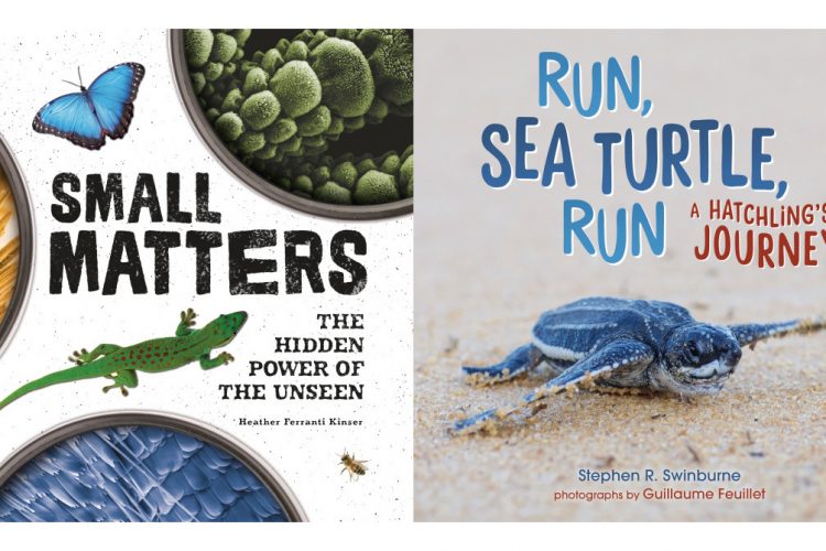
For Run, Sea Turtle, Run, the execution of the design was fairly simple, but getting the ratios of space, text, and image just right took some fiddling.

For Small Matters, the visuals are a lot simpler to look at than they were to make. The Photoshop files for the lenses got kind of crazy with reflections and shadows and whatever else. The background speckle texture was also unexpectedly complicated to deal with and took a lot of adjusting to get it to look right.
Do you have a favorite spread in each book and why, if you care to elaborate?
For Run, Sea Turtle, Run, my favorite spread is where you see a group of little sea turtles emerging from the sand, and some of the lines in the text have a fun emphasis to them. It’s cute.

For Small Matters, my favorite spread, by far, is the cat spread because it’s a picture of my cat, Boba. I was really excited to be able to put a full bleed image of my cat into the book. My niece was pretty excited about it too. “IS IT BOBA? IT’S BOBA!”


Comments
I’m thrilled to hear about the design process behind these two beautiful (if I do say so myself) books! Many times I have wondered what magician was behind the scenes, making my book visually stunning. Viet, thank you! You are the unsung hero of my book, and I’m definitely singing your praises. And the cat page will always have special meaning to me, now that I know Boba’s name.
That was fascinating! Especially the close-up of the Boba’s tongue and the information of how it’s used for grooming purposes. I also enjoyed the photos of the two books!