The Art of Cover Design: The Disturbed Girl’s Dictionary
I asked designer Lindsey Owens if she had things to say about the cover design for our novel The Disturbed Girl’s Dictionary that she’d like to discuss on the blog, and yes, yes she did. Today’s Dispatch from the Design Department—and a look into life in publishing—is courtesy of Lindsey. Also, I don’t make a practice of giving people work to do on road trips, I promise!—Danielle Carnito, Trade Art Director
Six months into my career as a book designer, I was presented with the opportunity to undertake what I think is one of our most exciting and daunting projects: capturing the essence of an entire novel into a single cover.
Road trip detour
Near the end of a Friday, just as I was finishing up what I had hoped to get done before a weekend-long road trip, our art director Danielle called me into her office and handed me a few hundred pages of a manuscript bound together by a rubber band. With it came the honor of designing the cover for The Disturbed Girl’s Dictionary by NoNieqa Ramos—and a terrifyingly short few weeks to do it.
It only took a few pages to recognize the complexities and depth that came with Ramos’s novel. Deep in the cornfields of southern Minnesota, I sat in the passenger seat of my roommate’s car and could hardly imagine a single image that could do justice to what I was reading.
The narrator of Ramos’s novel, Macy, is humorous and memorable—but at the price of grim circumstances. In my hotel room that night, I highlighted lines from the novel that would resonate with readers and scribbled notes in the margins when any scrap of an idea came to me. But still the intimidating question remained: how could I possibly make a cover that looked like this novel read?
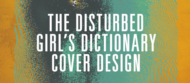
The final cover?
With only snippets of concepts and ten-second thumbnails, I came back to my desk the following week and buckled down.
Ramos and Macy say a lot in their three-hundred-plus pages, so I started with the key concepts that had stuck with me through them all. I went through several ideas, including:
- A machete, which is a special object to Macy (the machete ended up being the foil stamp on the hard cover—more on foil stamps here)
- A silhouette of Macy
- A family portrait with some elements scribbled out
- And other plot-related images collaged onto the people
Finally, I fixated on the bathtub in Macy’s home, which seems to be more of a home than her house itself.
After several iterations, I landed on the final design, which features a bathtub in conjunction with a few features, such as the splatter and erratic line pattern, that mirror the “disturbed” and “chaotic” elements of the book. The lime green and pinkish-red color palette complemented each other to bring out the intensity of both colors and emphasize the punchy style of Macy’s voice.
We had a cover that we felt worked visually, but presented enough disharmony to convey the electric tone of the book…or so we thought.

Plot twist
Fast-forward to a few months later. The cover was long gone from my desk when an e-mail landed in my inbox with a new thought: the pink-red splash and lines could be seen as blood, which presents a few misconceptions about the book’s plot.
The first possible fix was to remove the lines from behind the splash, since they could be conceived as something dripping down the wall. However, both Danielle and I could tell that the cover wouldn’t be nearly as dynamic without them. We went with what we felt was the best option: a color swap.
I wasn’t too worried about changing the colors on the cover, until I started trying to find two new colors that were just as intense yet compatible as the original palette. It was difficult to find a bright color that could sit on top of another bright color without vibrating or blending.
I came up with several new versions of the cover, all with the lines intact, and all with a fresh set of striking colors. I even included a version that kept the original green and pink/red, but swapped their placement.

In the end, we decided to go with the orange and teal palette, which we thought popped as much as the original, and still felt appropriately edgy without the implication of blood.

This cover proves an exercise in flexibility is sometimes necessary, and I look forward to future challenges of any exciting-yet-daunting novel covers. I’m so pleased with the final version—I hope you enjoy it (and the book!) as much as I do.
Start reading The Disturbed Girl’s Dictionary today
The Disturbed Girl’s Dictionary will be released on February 1, but you can start reading a sample chapter here.
The Disturbed Girl’s Dictionary is available for preorder through lernerbooks.com, Barnes & Noble, Amazon, IndieBound, and all major distributors.
Comments
[…] Designer Lindsay Owens noted that her process of designing book covers consisted of answering two questions: “Which lines would resonate the most among readers?” and “What do those lines look like?” While these might seem like simple, opinionated questions to answer, Owens’ couldn’t just make what she thought the story “looked like.” She had to create a cover that the readers would imagine the story to look like. If I were in the shoes of someone like Owens or Kidd, I would constantly be worrying if my cover was only suited for my personal tastes, and not towards the readers’ interpretations of the book. […]