Illustrator Q&A: Scott Roberts on Creating Wordless Graphic Novels
By Graphic Universe Associate Editorial Director Greg Hunter
Belinda the Unbeatable , the second volume of the Game for Adventure series of wordless graphic novels for early readers, tells the story of an outrageous game of musical chairs and a friendship between competitors (or, if you prefer, a competition between friends).
The book, by two-time Eisner nominee Lee Nordling (BirdCatDog and SheHeWe) and artist Scott Roberts, involves an original, fantastical landscape—as a school gymnasium transforms into a colorful obstacle course—and strong character dynamics, captured in a story that’s entirely word-free from front to back.
In other words, creating the art for a book like Belinda is no small feat. So with Belinda the Unbeatable set to arrive this fall, I asked Roberts for thoughts about his process in bringing this game to life.
Interview with Illustrator Scott Roberts
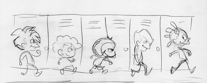
On Character Design
“You want to bring out the character’s personality. The smallest tweak in an eye, or the mouth, and the subtlest posing, can project a lot. It can tell the reader something right away that they’ll want to know in order to understand what part that character is going to play.
“And because these are wordless graphic novels, it’s even more important that the character design help in that way. When working with a collaborator, as I did with Lee, then you have more than one opinion, and you can bat ideas back and forth to help find the right design. You may not get it on the first try, and you often don’t!”

On Bringing a Scene from the Script Page to the Comics Page
“It’s a back-and-forth effort all the way. As the artist, I have to read the script, to see what the writer—in this case, Lee—wants to have happen. Lee’s scripts are very detailed. He knows his story. Even without dialogue, he tells you exactly what is happening. I’ll draw up a small and loosely sketched page—a thumbnail—and show that to Lee. If I get an idea that wasn’t in the script, and it seems to work, we might keep it.”
On Going from Pencils to Inks
“At each stage, [a page] grows and becomes tighter. The finished page has to be a specific size and specific dimensions, so that it’ll print correctly. The first stage is mostly creative. The final stage involves a lot of mechanical thinking and skill.”

On Coloring a Page
“Mood is vital. The right colors convey the time of day, the kind of place, or the character’s emotions. And colors have to balance each other. You have to avoid combinations that clash or make details hard to spot.
“For Belinda the Unbeatable, we decided on fantasy background colors for the game, so that it’s immediately apparent that the characters have left the more realistic gymnasium. And with so many characters, the costumes must have some variety, so they don’t blend into each other. Yet not too much, or it becomes too busy!”

Thanks, Scott!
Look for Chavo the Invisible, the final title in this series of wordless graphic novels, next spring.
Comments