5 Questions for Dazzle Ships Illustrator Victo Ngai
Recently back from Helsinki, Finland, where she attended the Hugo Awards ceremony as a finalist in the “Best Professional Artist” category, Victo Ngai found the time to answer a few questions about Dazzle Ships: World War I and the Art of Confusion, which comes out on September 1.
 1. What was the most surprising thing about illustrating Dazzle Ships, your debut picture book?
The most surprising thing was the subject matter itself! I have to confess that I didn’t know dazzle ships existed before starting this project. And I’m not the only one–when I showed an advance copy of the finished book to my friends, most of them thought I’d made up the wild patterns on the ships! I had to show them the historical photos at the end of the book to set them straight.
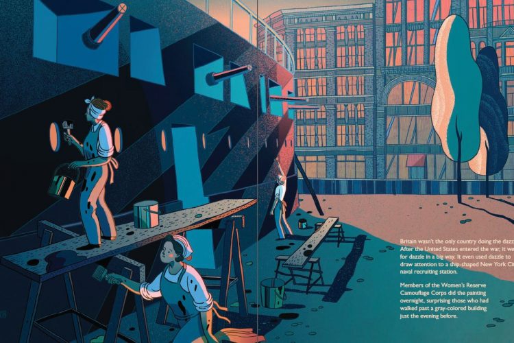
I’m surprised that this colorful and mesmerizing aspect of World War I is so under the radar. I have my author Chris Barton and editor Carol Hinz to thank for introducing this part of the history to me, and I hope many readers will find it as fascinating as I do.

2. The events of the book take place 100 years ago. What sort of research did you to to capture the time and place in your illustrations?
I referred to historical photos, maps, and paintings as well as written descriptions to capture the spirit of the time and place. This was especially necessary when trying to get the “hard facts,” such as country shapes, uniforms, and flags, correct. With the color palette, I referenced travel posters from the 1910s and 1920s in hopes of giving the book a look true to the time period.
However I did exercise quite a bit of artistic license as well, especially when it came to the shape of the battle ships and the pattern designs on them. I studied black and white photos as well as color paintings for these vessels to make sure they looked right, but when it came down to the details, I considered composition as well as historical accuracy.
Sometimes the “artistic license” was out of necessity–for example, I couldn’t find any images of the turning contraption King George V used to view a model of a dazzle ship, so I just had to make it up.

3. Who are some of the biggest influences on your illustration style?
Osamu Tezuka, Mary Blair, Hokusai, Dunhuang cave paintings, Chinese Blue and White porcelain, Bruegel, Bloch, Kay Nielsen, Magritte, Gauguin, Matisse, Charley Harper . . .
4. Are there differences in illustrating for children vs. illustrating for adults, or it the same for either audience?
There are certainly differences with the outcome, but I think they mostly originate from the subject matter. I see illustration as a vehicle for storytelling, therefore its expression should fit the tone and content of the story it’s trying to tell. I wouldn’t simplify my work just because it is intended for children. Especially since I think children are often not given enough credit–I still remember when I was a kid, I comprehended a lot more than adults thought I did. Moreover, when a children’s book is well done, adults enjoy it too, so the line between children vs. adult needn’t be so stark. All in all, I think age categories are probably more useful for marketing and library shelving than for creating art.

5. Unrelated to the book, you were featured in an article in Cosmopolitan China earlier this year. Can you share how that came to be?
It was a feature interview about art and my career (and my relationship of course, as it’s Cosmo!). I did a big outdoor billboard Chinese New Year campaign with Apple earlier this year, and that’s probably how they get to know my work. You can see the interview–and the photos–here.

Thanks, Victo!
Want more on Dazzle Ships? Author Chris Barton introduces the book and reads an excerpt on TeachingBooks.net. And if you’d like to see more of Victo’s work, follow her on Instagram.
Comments
I’m amazed that I didn’t know about Dazzle Ships! Such striking work… Congratulations!
This is just spectacular and kids are going to absolutely adore it. Who knew?